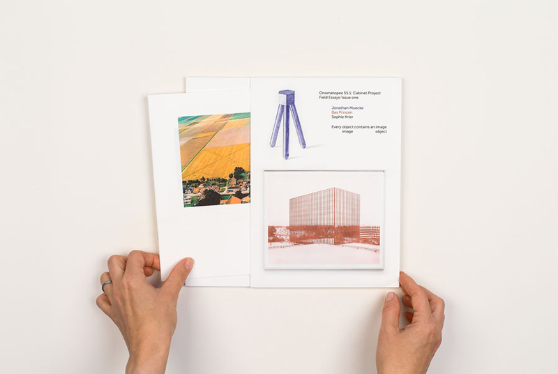
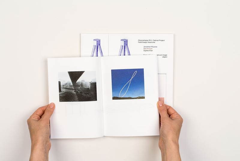
Graphic design for an occasional magazine dedicated to design thinking and making. Our starting point for this publication is the way Sophie Krier constructs her text which cites the two protagonists extensively, from beginning to end. We decided to give each of the voices in this publication a colour of their own. In this way, the exchange between Jonathan Muecke and Bas Princen is highlighted, and Sophie’s role as orchestrator of the collaboration is made evident. We see it as a theatre play in color. Another advantage of this principle is to allow the reader to quickly understand which statement belongs to which work, giving the content more legibility and lightness. You can find the color distribution at all levels of the publication—from the cover where the idea of the three voices is introduced directly, to the index where the labelling exposes the origin of the chapter titles.
client: Sophie Krier
publisher: Onomatopee, Eindhoven
technique: offset printing
format: 148 × 210 mm
pages: 120